Event Chart
The distribution of outcomes the market implies for one event, drawn to suit the kind of event it is.
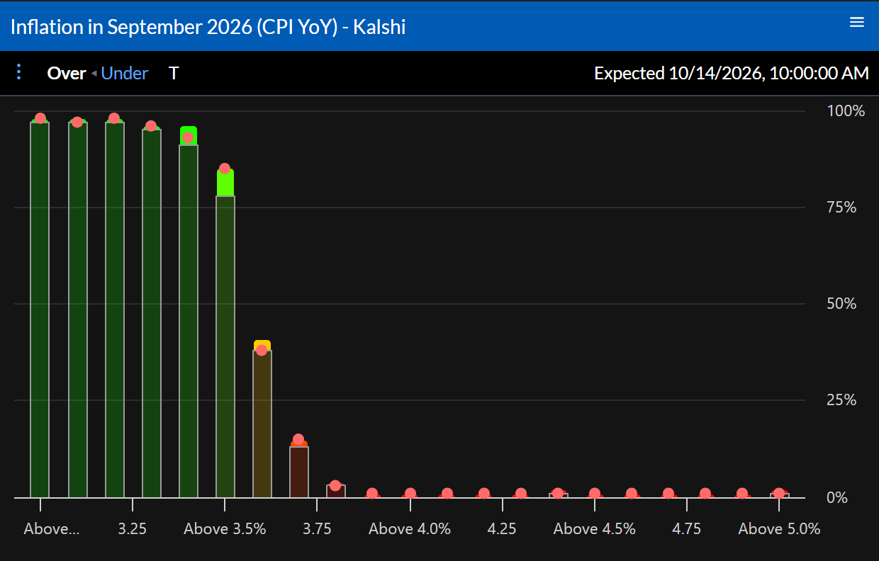
What it shows
The chart follows the event’s type:
- Ladders of thresholds (“above 3.5%”, “over 42.5 points”) show a bar per threshold, the chance the outcome lands above it. Over and Under flip the view.
- Ranges show the chance of each range, with Exactly and Not.
- Spreads show each side’s chance, and switch between the two sides.
- Scalar events show the expected payout across outcomes, or its inverse.
- Single markets show a gauge.
- Anything else, such as a list of candidates, shows each outcome’s chance as bars or a pie, Yes or No, with − and + for how many.
Clicking a bar opens a menu for that market.
Settings
The top bar holds the view toggles above. Configure sets the Provider and Event ID.
Actions
⋮ opens Open Event Table, Open Event History, and Open Related Events, and the Distribution Builder when you can trade the event.